Following on from the success of the Ysgol Cybi Logo Design, I was asked to work on the branding and logo design for Ysgol Santes Dwynwen; the third super school to be built by Anglesey County Council, in line with the school’s improvement programme “21st Century Schools”
As with the work done for Ysgol Cybi, I was presented with a series of children’s drawings to start the process of deciding what route to take with the logo design.
It was decided, by myself, Headteacher; Ms Manon Williams and Rev Canon Emlyn Cadwaladr Williams that the love spoon design, sketched out by pupil Caitlin would be the best route to take. Caitlins simple, but effective love spoon idea, which represented the love story of Santes Dwynwen at Llanddwyn Island was a perfect fit in what would be the brand embodiment of the school.
As with all design projects, the next phase of the design process was to illustrate more ideas based on the initial idea sketch. The research was also conducted in the following areas:
- Typography –
- It was required that the font chosen was easy to read up close and from afar
- A typeface which utilised the single story “a” – this meant that it was more of a primary school type of font i.e. where the lowercase ‘a’ has no top arch
- Available for use within the school’s computer systems without the need to install a new font on all PCs
- Colour – The correct use of colour is an important factor in any branding process. The uniform colour choice was already chosen by Ms Williams, the head teacher, so a colour matching process was needed. This was done by using the Pantone colour charts and Madeira Embroidery colour charts. Having this information ensured that any printing or embroidery of the logo was done using the correct colours. This ensures consistency with the brand as a whole. Basically, it ensures that all the colours used across all mediums are kept the same. Consistency is key!!
- K.I.S.S – The KEEP IT SIMPLE STUPID!! ethos is something used by all designers. Too often we see logos that are complex, fussy and don’t take into consideration where they will be used. For example, this logo will primarily be used on school uniforms and signage for the school. So keeping the logo simple and clearly defined was a must. With the logo being embroidered onto school jumpers, book bags, and more, the key here was to try and envision how the logo would stand up to being embroidered – would the embroidery machine be able to sew in intricate small details? probably not.


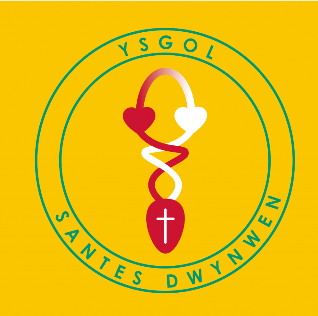
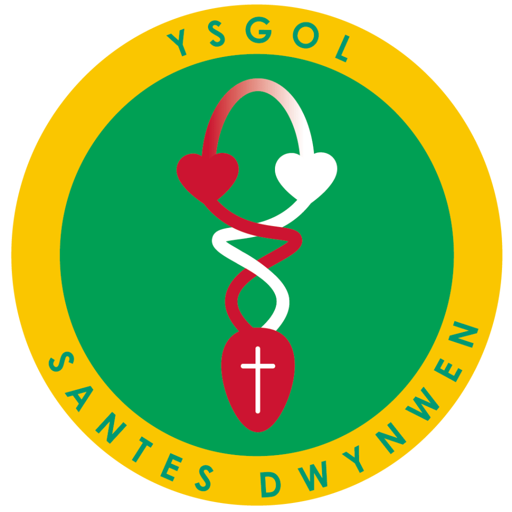
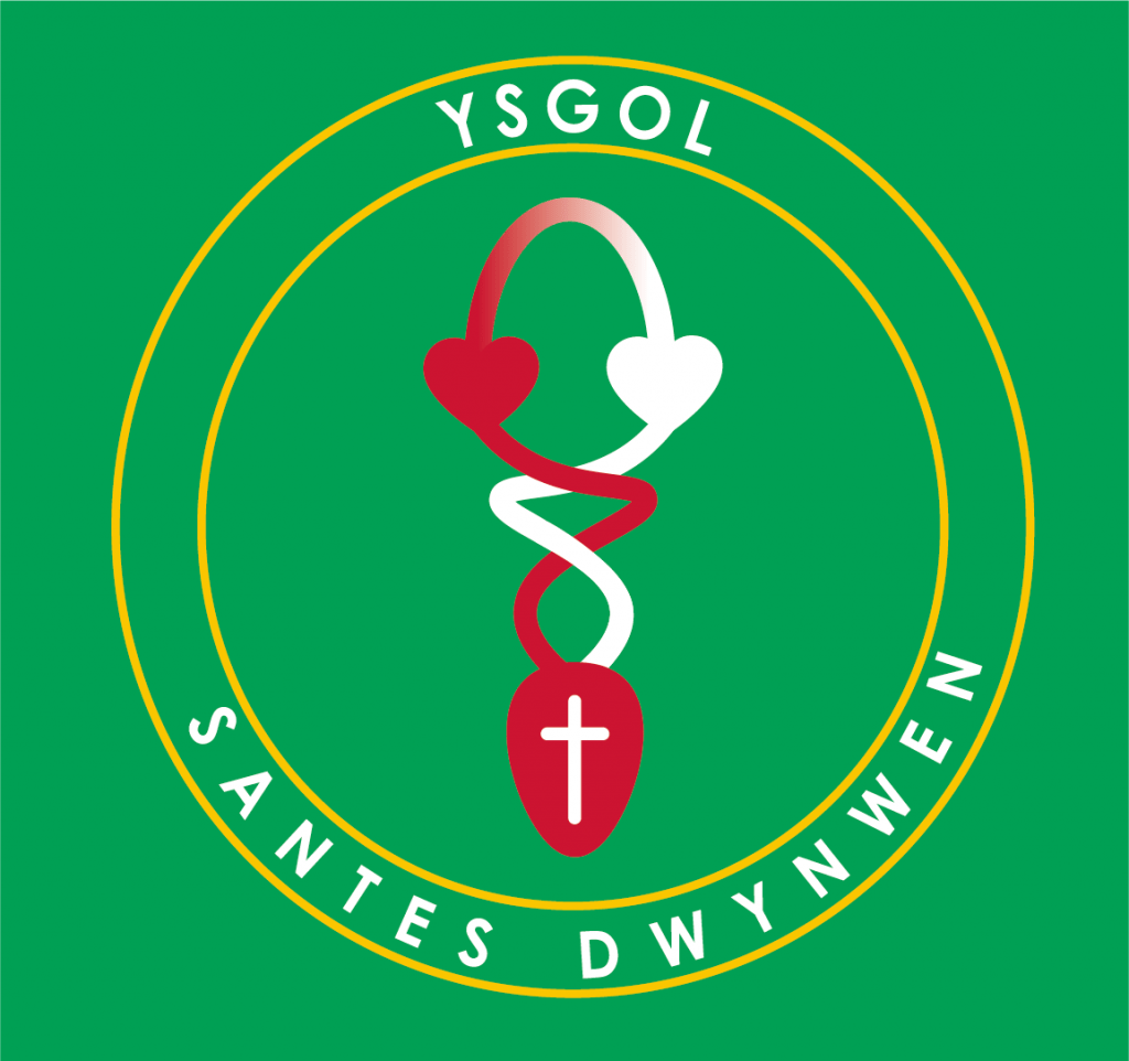
The final design consists of three versions. (as illustrated in the image above)
- Version 1 is for use on yellow polo shirts only
- Version 2 is for use on green jumpers only
- Version 3 is the one that encompasses both styles above and should be used on a white background
- The 4th version is the black and white (which is pretty self-explanatory)
The symbolism within the logo represents 3 areas.
- Santes Dwynwen – The Welsh patron saint of love whose tales of love and faith in Christianity are synonymous with Newborough, where Ynys Llanddwyn is based, and where the new school is currently being built. Dwynwen became a nun, fulfilling her wish to never marry. She left for the island of Anglesey and built a Church, which became known as Llanddwyn, literally meaning “Church of Dwynwen”. Its remains can still be seen today on the island of Llanddwyn, off the coast of Anglesey.
- The red heart represents the love for education, learning and development.
- The white heart represents the church’s role with the school, and how, with their guidance, pupils are taught the values of Christianity.
Both the white heart and red heart entwine beneath to form the love spoon. Combined, they represent the school.
Ysgol Santes Dwynwen is due to open in March 2019. you can follow its progress by following the Anglesey School Modernisation page over on Facebook.


