Tag: illustrated

The Logo Design Process

School illustration project


Following on from the success of the Ysgol Cybi Logo Design, I was asked to work on the branding and logo design for Ysgol Santes Dwynwen; the third super school to be built by Anglesey County Council, in line with the school’s improvement programme “21st Century Schools”
As with the work done for Ysgol Cybi, I was presented with a series of children’s drawings to start the process of deciding what route to take with the logo design.
It was decided, by myself, Headteacher; Ms Manon Williams and Rev Canon Emlyn Cadwaladr Williams that the love spoon design, sketched out by pupil Caitlin would be the best route to take. Caitlins simple, but effective love spoon idea, which represented the love story of Santes Dwynwen at Llanddwyn Island was a perfect fit in what would be the brand embodiment of the school.

Back in summer of 2016, I was asked to design a logo for the new super school being built in my home town. This was a biggie for me. Not only was it possibly the biggest design job Id had up to that point, but it was something that was going to last quite a few years, be seen by hundreds if not thousands of people, and my children were going to be wearing it every day in school!
Id known roughly what the brief would be. The children had come home one day with homework to design their school logo. So after a long chat and a coffee with Reverend Kevin, who had contacted me about the design work, I set about sketching out a few ideas based on the three key themes I had been given and the few ideas that my children had thought of.
The three key themes that came from all three schools homework were
- St Cybi’s Church
- Holyhead Mountain
- The Breakwater in Newry
The colour chosen for the school uniforms was turquoise which was in keeping with the colour of part of the new section of the school being built.
So after setting about to sketch and come up with a number of ideas, presenting the ideas to the board of governors and the headmaster, and then tweeking the favourite ideas, the final logo was decided upon.
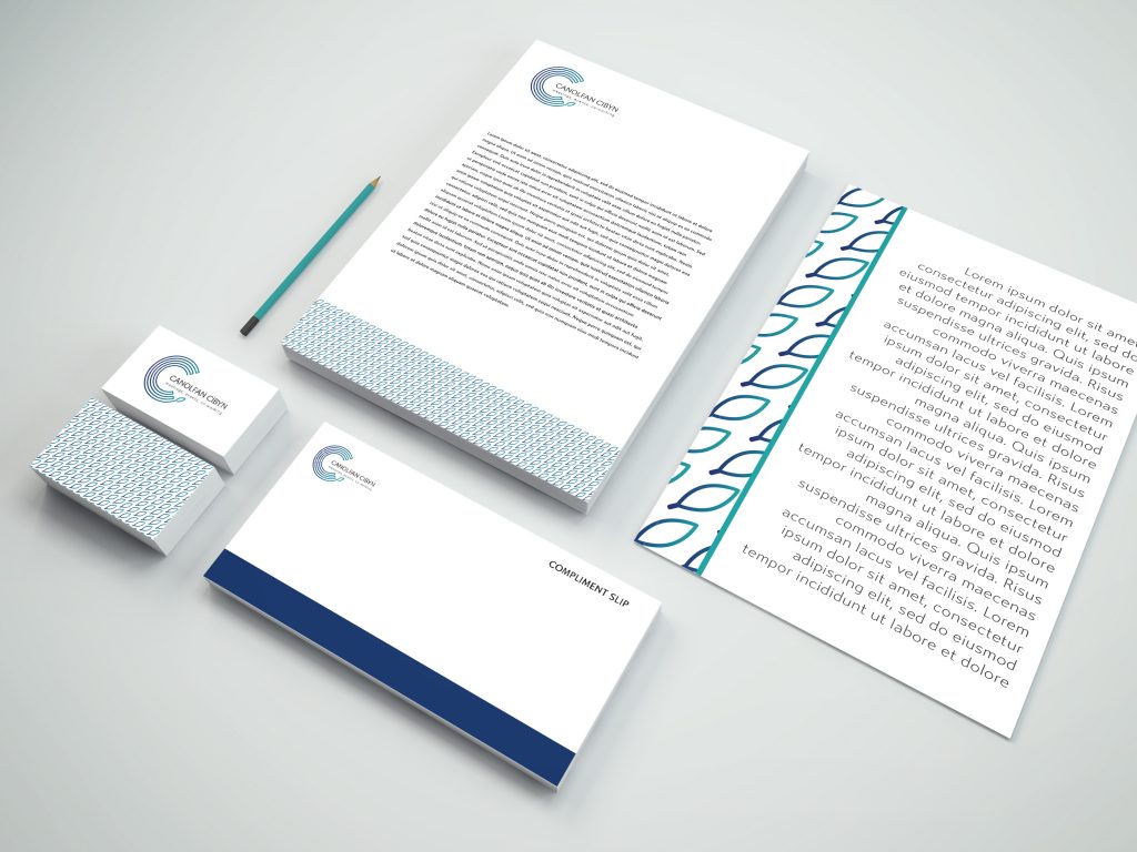
The final design is a simple, clean and recognisable logo mark which translates easily between black and white and colour, is applied easily to stationery, signage and clothing and will hopefully last a good few decades!
I would love to hear some of your thoughts on the final design so please post some comments or send me message through Facebook or the contact page here !
Bye for now!
Nia Sian xx


